THE CHALLENGE
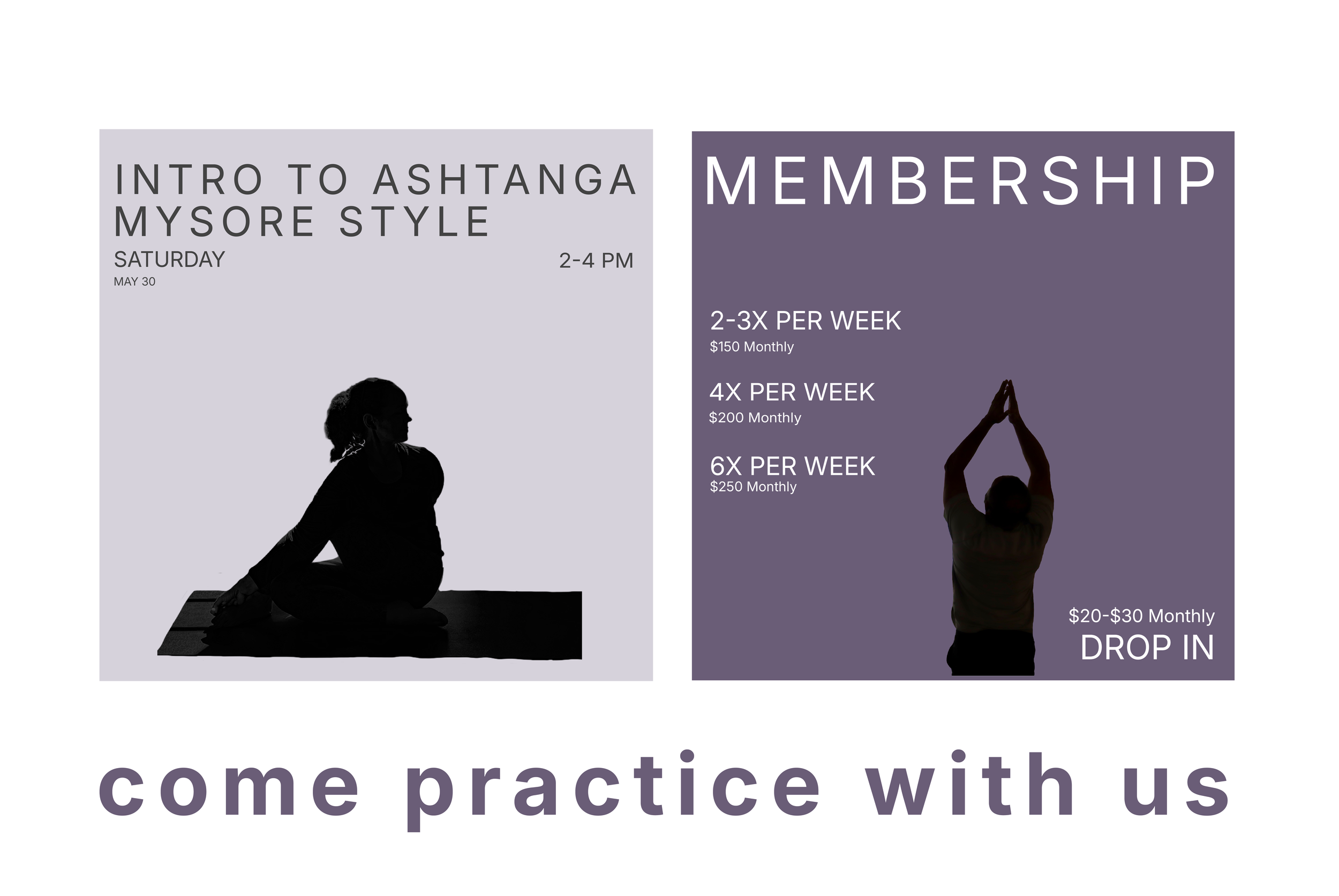
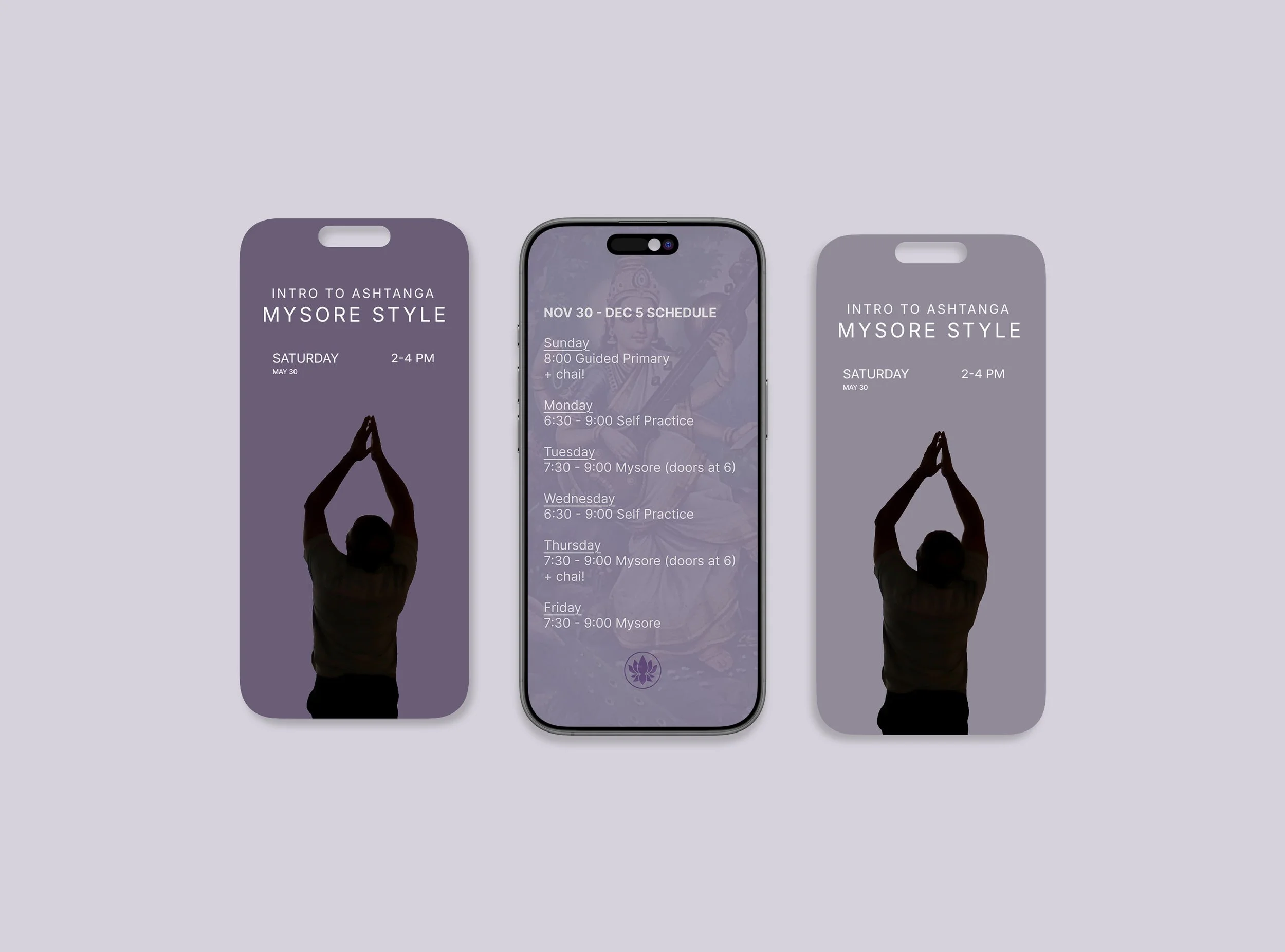
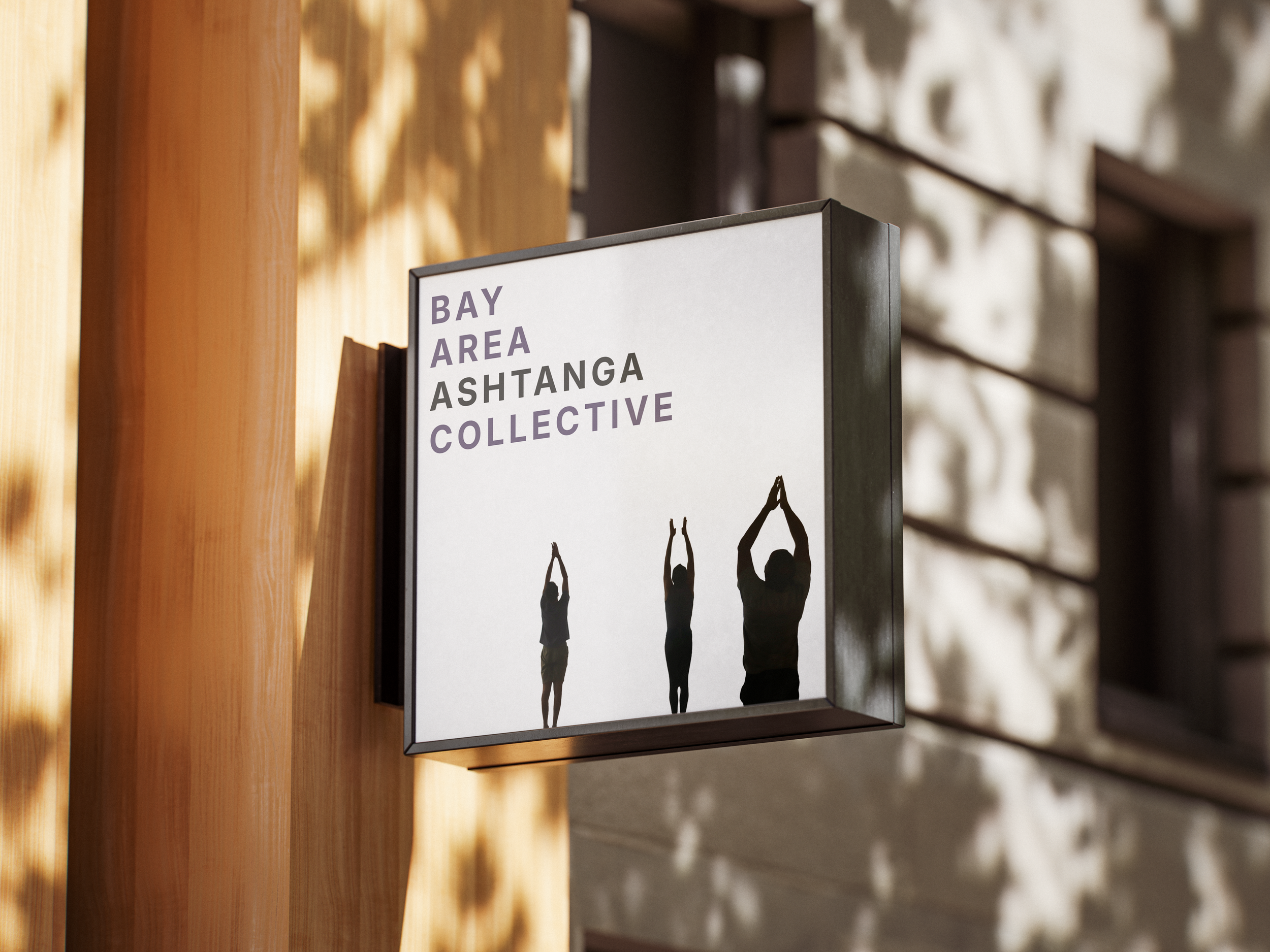
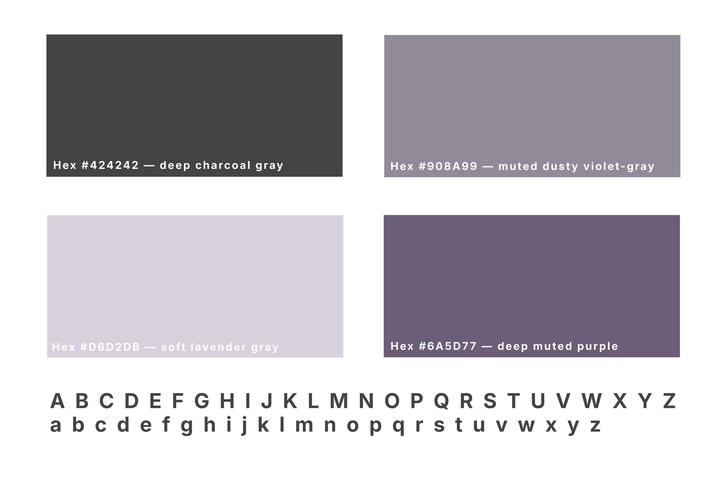
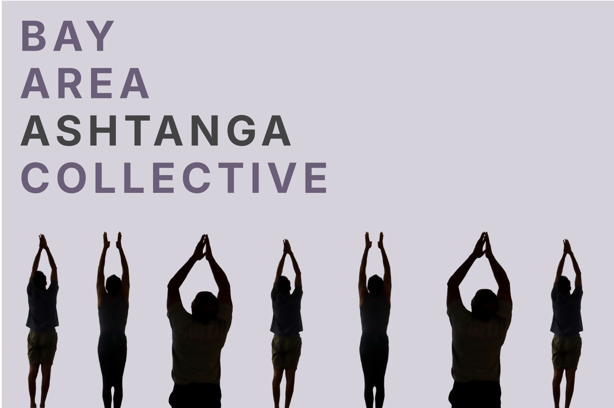
Bay Area Ashtanga Collective already had an established visual identity and web presence rooted in minimalism and calm. The challenge was to evolve the brand without losing the simplicity and warmth that existing members connected with.
The goal was to expand the identity into a more cohesive system across print, merchandise, signage, and social media while preserving the collective’s understated aesthetic, existing color palette, and welcoming atmosphere.
THE STRATEGY
The brand positions the studio as an accessible space for grounding and mental clarity, rather than performance or intensity. A minimalist visual direction reinforces this sense of ease and reduction, reflecting the stillness at the core of the practice. The tone is soft, inclusive, and unpressured, inviting practitioners of all levels into a shared sense of calm.